Inequality in New York City Neighborhoods, 1990-2015

This blog post consists of a collection of maps and graphs examining the changes in economic inequality throughout neighborhoods in New York City. The maps were inspired by Daniel Kay Hertz’s fantastic series of maps visualizing inequality in Chicago. See also my previous maps examining the change in income inequality in San Francisco. To create these maps and graphs, I used census block group data from the National Historical Geographic Information System. 

Rising economic inequality has been well documented both in New York City and throughout the nation. This post takes a look at one specific consequence of that rise in inequality: the decline of middle-class neighborhoods in New York City. The map below visualizes this decline from 1990 to 2015. Middle-income areas are colored in light-grey, upper-income areas in shades of green, and lower-income areas in shades of red. Because this map is so large it can be hard to see changes in individual neighborhoods, so throughout the rest of this post are maps for each of the five boroughs of New York City.

nNYNixo

In 1990, 40% of New Yorkers lived in middle-income areas, but by 2015 that number had dropped to 35%. This decline has not been uniform across NYC, but has instead varied widely between the five boroughs. Manhattan and The Bronx have seen many of their middle-class neighborhoods decimated, with less than 20% of their population residing in these areas by 2015. Queens and Brooklyn saw smaller, but still significant, declines in middle-class areas. Staten Island was the one borough to defy this trend, with a larger share of residents living in middle-class areas in 2015 than in 1990.

chart (2)

The share of New Yorkers living in upper-income neighborhoods increased during this period, going from 14% of the City’s population in 1990 to 18% in 2015. The number of people living in lower-income neighborhoods stayed relatively stable, at 46% in 1990 and 47% in 2015. However, once again these changes varied sharply between boroughs, with Manhattan and Brooklyn seeing large increases in the share of individuals living in upper-income neighborhoods, while Queens, The Bronx, and Staten Island have instead seen growth in lower-income neighborhoods. 

This post will examine trends in neighborhood income inequality for each of the five boroughs, going in order of their population size. Brooklyn will start, followed by Queens, Manhattan, The Bronx, and finally Staten Island. A few conclusions and final thoughts follow. The methodology, which describes how lower-income, middle-income, and upper-income areas were defined and measured, is located at the bottom of this post.

Brooklyn

Of the five boroughs, Brooklyn’s neighborhoods are most representative of the city as a whole, at least in terms of income. There are still some notable differences however. 56% of the population lives in lower-income neighborhoods, which is 9 percentage points higher than the city as a whole. In contrast, only 11% of Brooklynites live in upper-income neighborhoods, compared to 18% for the entire city.  The share of the population living in middle-income neighborhoods is very similar at 33% for Brooklyn vs. 35% for the City. Brooklyn has slightly poorer neighborhoods than the rest of the city, but this gap has declined over the past 25 years.

chart (1)

Since 1990 the share of Brooklyn residents living in upper-income neighborhoods has more than doubled, from 5% of the population in 1990 to 11% in 2015. This gain has come at the expense of both lower-income and middle-income neighborhoods. Interestingly, the growth of upper-income neighborhoods in Brooklyn has come entirely in the last 15 years. Between 1990 and 2000, the share of people living in upper-income neighborhoods was stable, as seen in the graph above. But after 2000 the population of upper-income neighborhoods rose sharply.

hHOmbV5

This rapid rise in the number of upper-income neighborhoods is tied to the gentrification of north-west Brooklyn. Neighborhoods such as Gowanus, Red Hook, Boerum Hill, and northern Williamsburg have undergone massive transformations in a relatively short period of time, going from lower-income or middle-income neighborhoods to some of the highest-income areas in the city. This transformation can be observed in the map above, as the red and grey areas between Park Slope and Manhattan disappear into a sea of green. 

Queens

Queens is the most middle-class borough in New York City. Well over a million Queens residents live in middle-income areas, 54% of the borough’s total population. Still, a significant chunk of Queens’ population, 33%, live in lower-income areas. However, unlike other borough’s in the city, the majority of low-income areas in Queens have median incomes just on the edge of middle-class status. These neighborhoods could be thought of as “lower middle-class” or “working-class”. Likewise, the majority of upper-income areas in Queens are not super-rich, but instead have median incomes only slightly above middle-class status. Thus, very few neighborhoods in Queens are intensely rich or extremely poor, which suggests that income inequality in Queens is significantly lower than in the rest of the city.

chart (3)

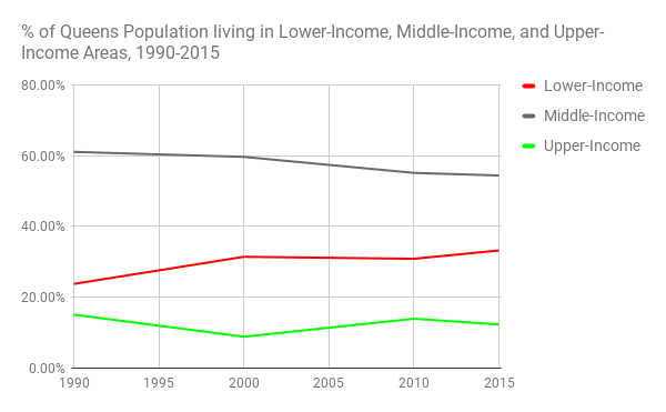
Despite Queens’ relatively low levels of inequality, since 1990 it has still seen a decline of 7 percentage points in the proportion of it’s population living in middle-class neighborhoods. The percentage of the population living in upper-income areas has also declined by 3 percentage points. In their place, many more residents are living in lower-income areas, although as noted earlier these areas are usually not intensely impoverished. It may be that Queens has become a refuge for those priced out of other parts of New York City, which could explain this rise in the proportion of the population living in lower-income neighborhoods.

qdYlqVU

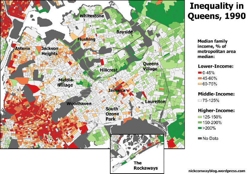
Neighborhoods in Queens have seen relatively subtle changes in income status over the past 25 years. One of the few changes visible in the map above is that lower-income areas around Flushing and Jamaica have grown in size. A more general change can also be seen throughout Queens, as large areas that had been almost entirely middle-income, such as Middle Village, Woodhaven, and Ozone Park, have seen bits and pieces of territory shift out of the middle-income category. These neighborhoods, after being almost entirely middle-income in 1990, became patchworks of low-income, middle-income, and high-income areas by 2015. Still, it is difficult to see many dramatic changes in these neighborhoods, especially compared to some of the neighborhood transformations in Brooklyn or Manhattan. 

Manhattan

Manhattan’s neighborhoods look drastically different from the rest of the city. The borough is starkly divided between lower-income and upper-income neighborhoods, with very few middle-income neighborhoods in between. The share of residents living in upper-income neighborhoods is particularly large, at 47%. Of all New Yorkers who live in upper-income neighborhoods, more than half live in Manhattan, despite the borough having less than 20% of the total population of New York. This concentration of upper-income neighborhoods becomes even more stark when looking at extremely high-income neighborhoods, defined as those neighborhoods with a household median income over 200% of the metropolitan area median income (this translates to neighborhoods with a median income of over $137,500 dollars in 2015). Over 80% of the New Yorkers living in these extremely high-income areas reside in Manhattan. 

chart (1)

By 1990 Manhattan already had a much smaller number of middle-class neighborhoods compared to the other boroughs, but even these few middle-class neighborhoods have shrunk rapidly. 29% of residents lived in middle-income areas in 1990, but by 2015 the number had dropped to 18%. Likewise, the share of the population living in low-income areas dropped from 47% to 35%. The share of the population living in upper-income areas has skyrocketed, and is well on it’s way to becoming a majority within the next few years.

81m938n

Those middle-income areas that remain are mostly positioned as thin buffers between intensely high-income and intensely low-income areas, such as a few blocks located between Midtown and the Lower East Side, or middle-class pockets wedged between the Upper East/Upper West sides and Harlem. Middle-income neighborhoods that existed in 1990, including portions of the Upper West Side and Midtown, have rapidly transitioned into high-income areas. Lower-income areas around Washington Heights, Harlem, and the Lower East Side have all shrunk dramatically over the past 25 years. This dramatic transformation of Manhattan shows no signs of slowing down.

The Bronx

As of 2015, The Bronx has by far the largest number of people living in low-income areas compared to the rest of the city, at 77%. Additionally, 46% of the Bronx population lives in “extremely low-income” neighborhoods, defined as those where the median household makes less than 45% of the metropolitan area median income. In 2015, this meant that the median household income in “extremely low-income” areas was less than $31,000 a year. There are still some middle-income areas in the Bronx, but they only contain 18% of the population. A handful of upper-income areas contain another 5% of the population.

chart

Since 1990, the number of individuals living in low-income areas increased by 8 percentage points, while the number living in middle-income areas dropped by 8 percentage points, and the number in upper-income areas remained stable. Nearly all of the jump in the number of people living in low-income areas occurred between 1990 and 2000. Since 2000 the low-income portion of the population has stayed flat, while the % of the population living in middle-income areas has slowly dropped and the % living in upper-income areas has slowly risen. This suggests that the already-small number of middle-class neighborhoods in the Bronx are in danger of shrinking even further.

8x0bgXN

The Bronx is starkly divided geographically, with the south-western portion of the borough composed almost entirely of low-income areas, while the eastern portion of the borough has more middle-income and high-income areas. There is also a pocket of high-income areas in the neighborhood of Riverdale in the north-west corner of the borough. Between 1990 and 2015, the main geographic change visible was the transition of some portions of the eastern section of the borough from middle-income to low-income. The neighborhood of Allendale is a good example of this, as in 1990 only the western edge of the neighborhood was low-income, wheareas by 2015 most of the neighborhood had transitioned. The western half of the borough remained more stable, with south-west neighborhoods like Belmont, Highbridge, and Mott Haven remaining solidly low-income, while Riverdale remained mostly high-income.

Staten Island

Staten Island’s neighborhoods have a very different income distribution from the rest of the city. Only 14% of Staten Island residents live in low-income neighborhoods, far lower than any other borough. 51% of the population lives in middle-income neighborhoods, second only to Queens, and 35% of the population lives in upper-income neighborhoods, second only to Manhattan. The island has a relatively low level of inequality compared to the rest of the city, and is generally on the wealthier side. 

chart (4)

Not only is the current composition of Staten Island radically different from the rest of the city, but it has also been subject to very different trends. The broadest trend across the rest of the city has been a decline in the number of people living in middle-income areas, and an increase in the number living in high-income areas. In Staten Island, this trend has been reversed: The number living in middle-income areas grew by 12%, while the number living in high-income areas declined by 14%. It seems that incomes did not grow as quickly in Staten Island as in the rest of the city, meaning that many high-income areas slid back into middle-income status. 


2BGhvT4

No Staten Island neighborhoods saw the dramatic swings in income that areas in Manhattan and Brooklyn saw. Even the more subtle changes seen in The Bronx and Queens are hard to pick out in Staten Island. One visible trend is that Southern Staten Island had been mostly green in 1990, but by 2015 the area had transitioned to a mix of upper-income and middle-income areas. Areas scattered across the island went from being light green, representing the lowest category of upper-income, to being grey for middle-income areas.

Conclusions:

New York City as a whole has seen a rise in upper-income neighborhoods, and a decline in middle-income neighborhoods, but this trend has varied greatly between boroughs. Some parts of the city, including portions of Brooklyn and Manhattan, have seen rapid increases in the number of upper-income neighborhoods due to gentrification and the pricing out of lower-income residents. Other boroughs, including Queens and the Bronx, have been more stable and seen less dramatic changes in their income composition, although their middle-class neighborhoods have also declined in numbers. Staten Island in many ways is the outlier, as it’s middle-class residents have grown while the number living in high-income neighborhoods.

Making predictions is always dangerous, but it certainly seems as if Manhattan will continue on it’s path towards becoming homogenously upper-income. Brooklyn has farther to go, but is being effected by many of the same forces as Manhattan. As more census data is released, it will be critical to see whether areas in Queens, the Bronx, and Staten Island begin to be affected by these same forces, or if these boroughs will remain bastions of middle-income and low-income neighborhoods. The effects of these changes in the city will continue to ripple out into the rest of the Tri-State Area, as more residents are priced out and move to other nearby cities and suburbs.

Methodology

The incomes of areas/neighborhoods were measured using census block group data, with the household median income of each block-group compared to the household median income of the New York City metropolitan area. Block-groups where the median income was less than 75% of the metropolitan area median income were defined as lower-income, 75-125% was defined as middle-income, and areas with 125% or more of the metropolitan area median income were defined as upper-income. 

It is important to note that these figures represent the number of people living in each type of neighborhood, rather than the number of households that are themselves lower-income, middle-income, or upper-income. For example, 35% of New Yorkers live in middle-income areas as of 2015, which is different than saying that 35% of New Yorkers are middle-income themselves. These two concepts are strongly related, but not equivalent to each other. You could, theoretically, have an upper-income neighborhood with a large minority of lower-income residents. This neighborhood would be classified as upper-income under my system, even though a large portion of it’s residents live in poverty. Or you could have a neighborhood with roughly even proportions of lower-income, middle-income, and upper-income residents, which would make the neighborhood a middle-income neighborhood even though most of it’s population was not middle-income. However, research has shown that neighborhoods are becoming increasingly homogenous, meaning that upper-income neighborhoods have fewer and fewer poor residents, and lower-income neighborhoods have fewer and fewer rich residents (http://www.pewsocialtrends.org/files/2012/08/Rise-of-Residential-Income-Segregation-2012.2.pdf).

Best-Selling Album by Year, 1992-2016

Top-Selling Albums

This chart shows the best-selling album by year from 1992 to 2016. Only albums sold within each year are counted.  Since it’s the best-selling album within a year, it often helps for an album to be released earlier in the year, since it then gets the more months of sales. Some albums which were the best-selling in a certain year were actually released the previous year, such as Jagged Little Pill by Alanis Morissette, which was released in 1995 but was the best-selling album of 1996. Another example is 21 by Adele, which was released in 2011 but was the best-selling album in both 2011 and 2012.

Source:

https://en.wikipedia.org/wiki/List_of_best-selling_albums_by_year_in_the_United_States


Projected Healthcare Coverage Loss under the Senate Republican Healthcare Bill, by US State

Healthcare Losses

This map shows the projected net drop in the number of people with healthcare coverage by 2026 as a percentage of each state’s projected 2026 population. The non-partisan Congressional Budget Office estimated that the Better Care Reconciliation Act (BCRA), the Senate Republican’s version of the healthcare bill, would increase the number of people without insurance by 22 million people in 2026, relative to current law.  The Center for American Progress, a progressive think-tank, then created their own estimates of how this 22 million drop in coverage would be distributed across the US.

I took these state by state projected coverage losses and divided them by the population of each state in 2026 to get the net % of the state’s population that would lose coverage. I was unable to find a projection for the 2026 population, but the Cooper Center had population projections for each state for both 2020 and 2030, so I used those to create an estimate for the 2026 population. This projection will obviously not be exact, but it should only affect the estimates on the margins.

North Carolina would see the largest share of their population lose coverage under the BCRA, with 1,348,300 people losing coverage, equaling 12.1% of the state’s 2026 population. The majority of southern states would be hit hard with coverage losses, as would north-western states like Nebraska, Wyoming, Idaho, Montana, and Alaska. The Southwest, Midwest, and New England would see smaller losses as a share of their population, although Vermont and Maine would lose a lot of coverage. North Dakota would see the smallest reduction, a loss in coverage for 25,100 people, 2.8% of the state’s 2026 population.

State Net Coverage Loss by 2026 2026 Population % of Population losing Coverage
Alabama 480,500 5,022,882 9.57%
Alaska 64,500 799,748 8.07%
Arizona 461,000 7,825,693 5.89%
Arkansas 172,400 3,108,621 5.55%
California 2,483,000 43,340,158 5.73%
Colorado 240,100 6,462,721 3.72%
Connecticut 206,800 3,623,350 5.71%
Delaware 59,500 1,052,949 5.65%
District of Columbia 41,200 847,324 4.86%
Florida 2,086,500 23,692,297 8.81%
Georgia 963,200 11,392,280 8.45%
Hawaii 58,200 1,590,275 3.66%
Idaho 144,700 1,850,456 7.82%
Illinois 654,800 12,912,550 5.07%
Indiana 270,400 6,903,913 3.92%
Iowa 127,900 3,287,772 3.89%
Kansas 198,200 3,033,930 6.53%
Kentucky 231,400 4,603,890 5.03%
Louisiana 343,000 4,963,945 6.91%
Maine 117,900 1,330,507 8.86%
Maryland 227,400 6,513,263 3.49%
Massaschusetts 285,300 7,328,967 3.89%
Michigan 489,400 9,996,796 4.90%
Minnesota 217,600 5,889,676 3.69%
Mississippi 278,000 3,042,504 9.14%
Missouri 479,000 6,279,214 7.63%
Montana 81,100 1,128,361 7.19%
Nebraska 173,100 2,047,640 8.45%
Nevada 122,500 3,327,906 3.68%
New Hampshire 45,500 1,359,273 3.35%
New Jersey 418,300 9,303,740 4.50%
New Mexico 133,400 2,138,070 6.24%
New York 1,139,000 20,670,766 5.51%
North Carolina 1,348,300 11,173,353 12.07%
North Dakota 25,100 899,823 2.79%
Ohio 469,600 11,765,616 3.99%
Oklahoma 395,100 4,261,102 9.27%
Oregon 283,300 4,468,784 6.34%
Pennsylvania 731,000 13,002,441 5.62%
Rhode Island 45,800 1,063,341 4.31%
South Carolina 458,000 5,505,311 8.32%
South Dakota 63,700 957,376 6.65%
Tennessee 634,600 7,153,339 8.87%
Texas 2,430,600 33,007,950 7.36%
Utah 186,000 3,541,234 5.25%
Vermont 51,200 626,280 8.18%
Virginia 521,800 9,225,884 5.66%
Washington 298,700 8,186,933 3.65%
West Virginia 118,100 1,825,027 6.47%
Wisconsin 394,100 5,944,911 6.63%
Wyoming 49,000 635,003 7.72%

NBA Win-Share Charts,


I last looked at each NBA team’s win-share charts in Mid-December, see this link to look at those older versions of the charts.

These charts look at each team’s distribution of “win shares” across players. Win Shares are a measure of a players total contribution to a teams success, as explained here:
http://www.basketball-reference.com/about/ws.html

A few notes:

-If you don’t see a player listed in the win-share pie chart, it’s because they either have 0 win shares or negative win shares.

-The change in win-shares is stated as being from December 15th to February 15th. That is slightly incorrect, as the change is actually measured from December 8th to February 16th.

-Obviously a lot of the changes in win-shares for players come from players being injured or traded. However, there are still some large changes in the win-share % of certain players who did not suffer any major injuries. See Anthony Davis as an example in New Orleans, who’s percentage of the team’s win-shares has dropped sharply as other contributors have picked up some of the slack for him.

-The change in a players win-share percentage is sometimes greater than their total win-share percentage. This is for one of two possible reasons:

1. In Mid-December those players had a negative win-share total.

2. It is an artifact of the fact that I could not include players with negative win-shares in the pie charts. I made the mistake of including those players when calculating the change in each players win-share %, which meant that players who were on a team with lots of negative win-share players saw their percentages inflated, since the total number of win-shares on the team was lower. I probably shouldn’t have calculated them this way for consistency’s sake, but by the time I realized it was too late and I was too lazy to go back and change everything.


NBA Championship Run Win-Share Charts, 1990-2016

These charts look at each NBA champion’s distribution of “win shares” across players during their playoff runs. Win Shares are a measure of a players total contribution to a teams success, as explained here:
http://www.basketball-reference.com/about/ws.html

Some players on a championship team are not listed, either because they had negative win shares, a net of zero win shares, or did not play in the playoffs.

Some random observations on a few team’s championship team’s win-share distributions:

2014: The Spurs player with the most win-shares during their 2014 run was Tim Duncan, at 17% of their win-share total. This is by far the lowest percentage for any championship team’s top player. The 2014 Spurs really live up to their reputation as a team that shared the ball and had everyone contribute, as 6 different players had over 10% of the team’s playoff win shares apiece.

2013: This is the most recent year where the top player on a championship team had over 30% of the team’s playoff win shares (Lebron obviously). Interesting to note that the “Big Three” according to win-shares for this playoff run was not Lebron, Bosh, and Wade, but actually Lebron, Bosh, and Andersen. Wade had a bit of a down playoffs, and the Birdman was able to sneak into the top three in win shares.

2012: Like in 2013, one of the “Big Three” didn’t make the Heat’s top three in win-shares. In this case, the Big Three was Lebron, Wade, and Mario Chalmers, with Bosh falling to fourth in win-shares during this playoff run.

2004 Pistons: This is one of the most unique win-share distributions of any championship team. Chauncey Billups led the team with 20.4% of their playoff win shares (only Duncan on the 2014 Spurs had a lower % of win shares as the top player on a championship team), but Ben Wallace also had 20% and Richard Hamilton 19.4%. That means there was only a 1% difference between the top player and the third player in win-shares, by far the lowest of any team. This is one of the few championship teams without a clear-cut top player, or even top two players.

2003 Spurs: This was a very un-Spursy Spurs team, with Duncan carrying a massive load with little help at 34.9% of all the team’s playoff win-shares.

2000 Lakers: Shaquille O’Neal had the highest win-share % on any championship run, at 35.3%. During this playoff run Kobe wasn’t quite on his level yet, at only 15.8% of the team’s playoff win-share total.


NBA Win-Share Charts, as of 12/8/2016

These charts look at each team’s distribution of “win shares” across players. Win Shares are a measure of a players total contribution to a teams success, as explained here:
http://www.basketball-reference.com/about/ws.html

Some of the teams with interesting win share distributions:

New Orleans Pelicans: Anthony Davis has 42% of all New Orleans’ win shares, the highest % for any player. The next highest player on the Pelicans is Tim Frazier, all the way down at 9%.

Detroit Pistons: Andre Drummond has the most win shares on the Pistons, but this is only 18% of the teams total, which is tied for the lowest % for the top player on a team. The Pistons have a very egalitarian distribution of win shares, with 5 players having above 10% of the total win shares.

Denver Nuggets: The Denver Nuggets has two players tied for the most win shares on the team, both also at 18%: Danilo Gallinari and Kenneth Faried. The player with the third-most win shares, at 17% of the total, is Wilson Chandler, while Nikola Jokic has 16%. Thus the gap between the player with the fourth-most win shares, Jokic, and the player with the most, Gallinari, is only 2 percentage points, by far the lowest in the league.


Third-Place Candidate, by county, 2016 Presidential Election

thirdparties

The map above uses preliminary results from the 2016 US presidential election to show the third-place finisher in the presidential election in each county. In almost every county the top two candidates were Donald Trump and Hillary Clinton (with the exception of several extremely conservative and heavily mormon counties in Utah and Idaho where Hillary fell to third behind Independent Evan McMullin).

The Libertarian ticket of former New Mexico Governor Gary Johnson and former Massachusetts Governor William Weld received 3.3% of the nationwide popular vote, over 4 million votes total, which was by far the strongest performance of a third-party this year. It was also the best result for a third-party since Ross Perot’s Reform Party run in 1996. This success is evident on the map, as the Johnson ticket reached third-place in the vast majority of counties in the US.

Jill Stein of the Green Party came in fourth in the national popular vote with 1.3 million votes (1%). She was only able to reach third-place in a handful of counties. Among these were several major cities, including Portland, San Francisco, Oakland, and New York City (she had more votes than Johnson in every borough except Staten Island). She was also the strongest third-party candidate on most of the islands of Hawaii (and the San Juan islands of Washington state), part of the northern coast of California (Humboldt and Mendocino counties), and two Native American reservations in North Dakota and one reservation in Wisconsin, along with a couple of other counties.

Evan McMullin is an interesting case. He ran as an independent conservative, hoping to gain the votes of Republicans who were unhappy with Donald Trump. However, he entered the race late and was unable to get on the ballot in most states. Additionally, Republican voters ended up coming home to the party, voting in strong numbers for Trump. McMullin, who is LDS, ended up as the “mormon candidate”. Trumps was unpopular among the conservative Mormon population, which allowed McMullin to pull 21% of the vote in Utah and 7% in Idaho. Nationally, he came in fifth, receiving only 0.4% of the vote, but he came closest of any third-party candidate to capturing a state. McMullin actually placed second in several counties in Utah and Idaho, beating Hillary Clinton in those areas, though he placed third overall in both states. Donald Trump did not fall to third in any counties, though he came closest in the District of Columbia, where he received 4% of the vote and write-in’s received 2.5%.

This year also saw an uptick in the number of “write-in” votes. For example, write-ins dominated the third-party vote in Vermont, and these votes were almost certainly  for the state’s own Senator Bernie Sanders. Almost 8% of Vermont voters wrote-in a presidential candidate on their ballot. Write-ins also placed third in one county in western Wyoming, and in the District of Columbia.

Nevada is the only state with a “None of these Candidates” option on the ballot, and it got 2.6% of the vote in that state and won third-place in two rural Nevada counties.

Finally, the Prohibition Party’s candidate, James Hedges, received 5,565 votes nationwide (apparently the best showing for the Prohibition Party since 1988), which comes to 0.00004% of the national vote. Nonetheless, despite this tiny showing, James Hedges somehow came in third in Arkansas County, Arkansas, with 133 votes, beating Gary Johnson’s total by 7 votes.

Several other third-parties ran candidates, such as the Constitution Party (0.14% of the vote) and the Party of Socialism and Liberation (0.04% of the vote), but none of these parties finished third in any counties.

The disappearance of San Francisco’s middle-class neighborhoods, 1990-2010

Over the past 30 years San Francisco’s middle-class neighborhoods have been decimated. In 1990, 60% of San Francisco residents lived in middle-class areas, but by 2010 that number had dropped to 41%. Given current trends, the next census report (in 2020) will almost certainly show an even smaller middle-class in San Francisco. These facts are not surprising, as the tech boom has made San Francisco a poster child for economic inequality. Countless think pieces have been written about the city’s problems with exploding rent, gentrification, and a widening income gap.

I wanted to add to this discussion by creating a series of maps showing how San Francisco’s inequality is distributed across the city. These were inspired by Daniel Kay Hertz fantastic series of maps visualizing inequality in Chicago. The maps below show a city that was solidly middle-class as recently as 1990, but has quickly become sharply divided between homogenous upper-income neighborhoods, and areas that are overwhelmingly low-income. Census block-group data was used, with the median income of each block-group compared to the median income of the San Francisco-Oakland metropolitan area. Low-income areas are colored red, middle-income areas are colored light-grey, and upper-income areas are colored green.

This slideshow requires JavaScript.

Map in gallery form.

In 1990 the map is dominated by a sea of light-grey middle-class areas, but by 2010 the map is much greener with many more upper-income areas. San Francisco has generally seen it’s middle-class neighborhoods transition towards the upper-income range, as opposed to becoming lower-income. In 1990 only 9% of San Franciscans lived in upper-income areas, but by 2010 that number was 32%. In contrast, the number living in lower-income areas declined from 31% to 26%.  Many of the residents of these lower-income and middle-income areas have been displaced to other parts of the Bay Area, or outside the metropolitan area altogether.

image (38).png
The table below shows the change in median income (as a % of the metropolitan area median) by neighborhood from 1990 to 2010, with middle-income values (between 75 and 125% of the metropolitan area median) bolded:

Change 2010 % of Metropolitan Median Income 1990 % of Metropolitan Median Income
The Presidio +79% 163% 84%
Potrero Hill +58% 148% 90%
South Beach / Financial District +55% 144% 89%
Noe Valley +50% 155% 105%
Mission Bay +50% 142% 92%
Lone Mountain/USF +37% 123% 86%
Marina +37% 145% 108%
Castro +36% 137% 101%
South of Market +35% 81% 46%
Haight-Ashbury +33% 128% 95%
Inner Sunset +33% 126% 93%
Hayes Valley +27% 89% 62%
Mission +27% 92% 65%
Pacific Heights +27% 152% 125%
Bernal Heights +27% 116% 89%
Russian Hill +21% 115% 94%
Japantown +20% 67% 47%
Twin Peaks +20% 128% 108%
West of Twin Peaks +20% 170% 150%
Glen Park +19% 132% 113%
Seacliff +18% 224% 206%
Outer Richmond +12% 103% 91%
Presidio Heights +12% 138% 126%
Outer Sunset/ Parkside +10% 110% 100%
Inner Richmond +10% 98% 88%
Outer Mission +9% 110% 101%
Western Addition +8% 68% 60%
North Beach +8% 83% 75%
Nob Hill +7% 75% 68%
Bayview/Hunters Point +5% 70% 65%
Excelsior +3% 100% 97%
Oceanview/Merced/Ingleside +2% 93% 91%
Portola +2% 94% 92%
Tenderloin -4% 28% 32%
Treasure Island -5% 64% 69%
McLaren Park -6% 25% 31%
Chinatown -6% 31% 37%
Visitacion Valley -12% 65% 77%
Lakeshore -14% 68% 82%

Neighborhoods that were middle-income in 1990 saw the greatest changes in their median income. 14 neighborhoods transitioned from being middle-income in 1990 to being upper-income in 2010, including Potrero Hill, the Financial District, the Marina, the Castro, and Inner Sunset, to name a few. A prime example of this trend is Noe Valley, which in 1990 had a median income that was 105% of the metropolitan area median, solidly middle-class. By 2010 Noe Valley had jumped all the way up to making 155% of the metropolitan area median, and was firmly in the upper-class range.

Some middle-income neighborhoods have remained fairly stable, but these neighborhoods are generally located on the fringes of the city, farther from workplaces and public transit. Neighborhoods that were middle-income in 1990 and remained that way through 2010 include Portola, Excelsior, and Outer Mission. The map below shows this pattern, as many of the neighborhoods with small changes in income are located on the southern edges of the city. Very few neighborhoods in the heart of the city have remained middle-class.

sanfranneighborhood19902010

Two neighborhoods that were middle-income in 1990 became lower-income by 2010, Visitacion Valley and Lakeshore. These two neighborhoods sit on the border of San Francisco’s city limits, and their decline in relative incomes was likely caused by working-class residents from other parts of the city moving there seeking out cheaper rent.

As for those neighborhoods that were low-income in 1990, there have been a few that  became middle-income by 2010. But these neighborhoods mostly consist of rapidly gentrifying areas like the Mission District and South of Market. So while they have moved into the middle-income category, these neighborhoods are suffering high rates of displacement and internal divisions between wealthier newcomers and older working-class residents. They may not remain middle-income for long, but instead transition into the upper-income category as newcomers make up a greater and greater proportion of these neighborhood’s population.

As for the area’s poorest neighborhoods such as Chinatown and the Tenderloin, they saw their incomes fall slightly from 1990 to 2010 (relative to the metro area). These neighborhoods have been left behind in San Francisco’s boom times, which contributes to the huge gap between the rich and poor in the city. It will be interesting to see if their median incomes rise by the 2020 census due to an influx of young professionals seeking out cheap rent. It’s also possible that these areas may benefit from the city’s low unemployment rate, with a recent report suggesting that San Francisco’s poorest resident have seen some economic gains. Nonetheless, it is disturbing that San Francisco’s tech boom has not increased incomes much for the neighborhoods in the most dire need of a raise.

Lastly, there were three neighborhoods that were already upper-income in 1990, Seacliff, Presidio Heights, and West of Twin Peaks. These neighborhoods all saw moderate increases in their relative incomes. But generally, they did not see as big of rises as areas that were middle-income in 1990. This makes sense, since their rents were already expensive in 1990 and they had less room for their incomes to grow.

Overall these maps and statistics tell the story of a city that is moving farther and farther away from an egalitarian distribution of wealth. As rental prices continue to increase, more and more areas of San Francisco will become unaffordable to the middle-class. The speed of this transformation is terrifying and depressing, but it also means that it was not long ago that San Francisco was significantly more egalitarian. Looking at the 1990 map of San Francisco’s neighborhoods shows a city much more open and available to people of average means. It is important that we don’t let the memory of that older San Francisco disappear.

Data Source:

Minnesota Population Center. National Historical Geographic Information System: Version 2.0. Minneapolis, MN: University of Minnesota 2011.

http://www.nhgis.org

Governor’s Political Party, by State, 1790-2016

output_7FessU.gif

The map above shows how political control of US governor’s mansions have evolved from 1790 to the present day. For times where multiple parties controlled the governorship over the course of one year, the party which had the longest period of control in that year are marked on the map. The map illustrates how power has shifted, from the Federalists to the Democratic-Republicans, then to the Whigs, and finally for the past 150 years to a back-and-forth struggle between Republicans and Democrats. Important to note: the effect of elections is usually only seen on the map the next year. For example, the 1994 midterms were a landslide for Republicans, but those governors did not generally take office until early 1995, so 1995 is when those states that flipped Republican turn red on the map.

Below, I go into some more detail about the trends in party control of governorships over different time periods, starting with our nation’s earliest political struggle between the Federalists and Democratic-Republicans.

1790-1824
image-38
The first party-system in the United States was divided between the Federalists, followers of John Adams and Alexander Hamilton, and the Democratic-Republicans, led by Thomas Jefferson and James Madison. The Federalists supported a strong national government, and in foreign policy were friendlier towards the British. The Democratic-Republicans favored a limited government, and desired good relations with the French. Geographically, the Federalists were strong in the North-East while the Democratic-Republicans dominated the South.

In 1790 the parties were fairly equally matched, while a large number of governors remained non-partisan. During George Washington’s second term (1793-1796) the Federalist party gained strength, eventually controlling half the nation’s governorships. John Adams was elected as the first and only Federalist President in the election of 1796, defeating Thomas Jefferson and the Democratic-Republicans. Thomas Jefferson won the presidency in a rematch in 1800, and the Democratic-Republicans gained popularity in the states under his administration as the Federalist party faded away. By 1810 the Democratic-Republicans had the governorship in almost 90% of states. The Federalists experienced a brief surge in support during the early stages of the War of 1812, as the war was initially unpopular in New England. But once the war ended in a victory for the US, the Federalists were discredited, and the party dissolved at the national level.

1825-1854
image-39
With the death of the Federalists as a national force, the Democratic-Republicans were the sole US political party for a short period of time. James Monroe faced only token opposition from the Federalists in 1816, and ran unopposed as the Democratic-Republican nominee in 1820, the last presidential race to feature only one candidate. However, the election of John Quincy Adams in 1824 broke the Democratic-Republican party apart. Into it’s place rushed two new parties, the Democrats, led by Andrew Jackson, and the National Republicans, led by Henry Clay. The Democrats would absorb most of the old Democratic-Republican supporters, while the National Republicans took up the mantle of the Federalists, arguing for a strong national government. The National Republicans were unable to defeat Andrew Jackson’s Democrats, and eventually transformed into the Whig Party.

The Whigs had more success as a party, electing William Henry Harrison in 1840 (he would die in office after only a month) and Zachary Taylor in 1848. They had less success at the state level however, only gaining a majority of governor’s mansions once throughout their decades long existence, in 1838. This was their peak, and they declined rapidly at the state level throughout the 1840s and early 1850s. The Democrats remained the d0minant party at the state level, but their hegemony was about to be broken by the “slave question”.

1855-1900
image-40
The issue of slavery quickly tore the nation apart in the 1850s. The Whig party collapsed due to bitter divides over this issue. Anti-slavery Whig and Democrats joined forces to form the new Republican party, which competed for the first time in the elections of 1854. The Republicans opposed the expansion of slavery into new states and territories, while the Democrats increasingly became a party representing slavery interests and the South. The Republican party gained strength in the North through the late 1850s, as former-Whigs and Know-Nothings (an anti-immigration party founded in the aftermath of the Whig collapse) joined their ranks. In 1860, Abraham Lincoln was elected president on a platform of stopping the spread of slavery, and the South seceded in reaction.

During the Civil War, the Republicans were dominant in the Union States, with only a few Democratic and Unionist governors serving during this time. The Confederacy abandoned it’s party system entirely, with non-partisan governors serving who were almost entirely former Democrats.

Republicans continued to gain strength at the state level after the Civil War ended. Reconstruction gave voting rights to blacks in the South, which created a huge base of support for the Republican party. Despite Democratic attempts to restrict blacks right to vote through violence and intimidation, the Republican party was able to gain control of a large number of governorships in the South. At the same time, they remained dominant in the North as the Democrats had been discredited by the Civil War. By 1869 the Republican party controlled 81% of all governor mansions in the US.

The two parties returned to more even footing after Reconstruction was violently ended by white supremacist campaigns. Democrats were able to suppress the black and republican vote in the South, giving them one-party control over those states. Meanwhile, in the North the Republican party had grown less popular as the Civil War receded in public memory. For two decades, from the mid-1870s to the mid-1890s, the Democrats generally controlled more governorships than the Republicans. There were a few years when Republicans briefly retook a majority of state governors mansions, but the Democrats vice-grip on the South gave them a large advantage.

The mid-1890s marked a transformation for both parties fortunes however. The two-party system was disrupted by the rise of the Populist Party. This party was an outgrowth of the Farmers Alliance, and gained massive support in the rural areas of the Western and Southern United States. Farmers in these areas were suffering economically, and felt abandoned by both major political parties. They forged alliances with labor groups in several states, and at their peak they controlled four governors mansions. The turmoil of this period, which featured a huge economic crisis in the form of the Panic of 1893, took place under a Democratic President, and Republicans were able to regain a consistent majority of state governorships despite being shut out in the South.

1901-1960
image-41
Republican strength at the governor level continued, with two exceptions, until the the Great Depression in 1929. The two exceptions were the 1910s, when the Republican party was bitterly divided between a conservative faction, led by William Howard Taft, and a progressive faction, led by Theodore Roosevelt. Democrats were also able to gain a majority of governors for a brief two year period from 1923-1924 under the Harding/Coolidge Administration.

But otherwise, it was not until the Great Depression that Republicans hold at the state level was broken. in 1930 Republicans controlled 63% of all governors. Just three years later, they controlled only 17%. Democrats had a huge majority of governors until 1939, while at the same time electing FDR to the presidency, and achieving 2/3rds majorities in the House and Senate. It was one of the most dominant periods for any political party in US history, as FDRs popularity was buoyed by the success of the New Deal.

The 1938 elections delivered a blow to the New Deal as Democrats margins were cut at the state and federal level. WW2 began shortly after, and Democrats continued to lose governor races throughout this period even as FDR remained popular. Republicans regained a majority of governor mansions in 1944, and the two parties proceeded to trade places over the next 10 years. But in 1955, after a recession under President Eisenhower, Democrats retook a strong majority at the state level.

1961-2016
image-42

Democrats held over 60% of the governorships every year for a decade, from 1957 to 1966. But big changes were underway, as the Vietnam War, Civil Rights Movement, and Womens Rights movement, among others, reshaped politics in the 1960s. A backlash against LBJ’s administration led to big gains for Republicans in 1966, who for the first time since Reconstruction became competitive in the South, this time buoyed by a backlash against the Democrats Civil Rights agenda.

This Republican resurgence was short-lived however, as Democrats regained state power during the Nixon and Ford administrations. After Watergate Democrats reached a peak, holding 72% of all governors mansions from in 1976, 1977, and 1978. Republicans were not able to retake a majority of governorships until after the huge Republican mid-term landslide of 1994, when Bill Clinton’s unpopularity gave them a solid majority of state houses along with both houses of congress for the first time in decades. Since 1995 Republicans have dominated at the state level with a rare exception, the 2007-2010 period when Democrats benefited from a backlash against the Iraq War and the Great Recession under President George Bush. But by 2011 Republicans had regained their state-level edge and today hold over 60% of all governor mansions.

Major Trends:
image-37
If we look at the trends over the past 160 years, since the advent of the Democratic-Republican party system in 1855, we see that generally no party maintains an edge in governorships controlled for more than a few years. The data is characterized by sharp turns, where one party may control 60% of governor positions for a few years, then plummet down to only 40% for the next few years. The longest periods when one-party had the majority of governor positions are from 1971 to 1994 for the Democrats (24 years), and 1895 to 1910 (16 years) for the Republicans. Generally, each party gained when the other party had a president in the white house, with a few rare exceptions such as the 1930s when Democrats continued to gain for a few years even after FDR took office.

Highest Peaks in % of Governorships Controlled:

Democratic Party:

1938: Democrats controlled 81% of all governorships. This was the peak of Democratic Power during the New Deal and Great Depression, as Democrats also had huge edges in the House and Senate due to FDR’s massive popularity. Their edge in governorships is even greater if you include the left-wing Farmer-Labor Party governor of Minnesota and the Progressive Party governor of Wisconsin in their totals. Republicans at the time controlled only 7 governorships. Republicans had been stuck in single digits since 1933, after FDR’s landslide election in 1932. The Great Depression took a huge toll on the Republicans during the 1930s, but the 1938 midterms would help them recover. Republicans jumped up to 19 governors as the nations recovery from the Great Depression suffered a setback.

1976-1978: Democrats controlled 72% of all governorships. These years, post-watergate but before Jimmy Carter’s popularity tanked due to foreign crises, oil shocks, and recessions, were some of the best for Democrats in recent memory. Democrats still had a solid grip on the South despite Republican attempts to break in post-civil rights, while Republicans in the north had been decimated by Nixon and Ford’s unpopularity.

1984: Democrats controlled 70% of all governorships. This one may seem surprising. 1984 was the year Reagan was re-elected in a landslide, but at the time Democrats were still dominant in the governor races. A recession in 1981-1982 had boosted their representation, and the South STILL had many Democratic governors even at this late date. Democrats also reached this 70% mark in 1959 after a recession under Republican president Dwight Eisenhower.

Republican Party:

1869: Republicans controlled 81% of all governorships. The Reconstruction period was great for Republicans, as the votes of newly enfranchised blacks in the South made Republicans competitive there, while the party was still popular in the North after it’s victory in the Civil War. From 1866-1870 Republicans had over 70% of all the nation’s governors under their control.

1921-1922: Republicans controlled 71% of all governorships. The party benefited from a  “return to normalcy” under popular president Warren G. Harding. The Democratic Party was unpopular after 8 years of Woodrow Wilson. Republicans held nearly every governorship outside of the South, which was still under one-party Democratic control.

1997-1998: Republicans controlled 64% of all governorships. Bill Clinton’s easy re-election in 1996 had not helped Democrats regain governorships from the Republican Party, as more southern states flipped to Republican control.

Know-Nothing Party:

1856: Know-Nothings controlled 19% of all governorships. The Know-Nothings, like the Republicans, rose out of the ashes of the Whig Party, but had much less staying power. Their platform was anti-immigrant and anti-catholic, but they could not avoid the political issue of slavery and quickly declined as their party was absorbed by the Republican and Democratic parties.

Populist Party: 

1897-1898: Populists controlled 11% of all governorships. The Populists were a left-wing insurgent party, dedicated to farmers aid and nationalization of the railroads. They allied with labour groups in several states, and were able to take control of four governor mansions, mostly in the Midwest with the exception of Washington, in 1897 and 1898, while the allied Silver Party took control of Nevada. Their party was already in the process of being taken over by Democrats under Williams Jennings Bryan by this point, and the Populists would quickly fade away like most third-parties.

Map at half-speed:

Map at double-speed: 

Map in gallery form:

NBA Finals Ratings, 1976-2016

NBAfinals.png

Year NBA Finals Average Rating
1976 11.5
1977 12.7
1978 9.9
1979 7.2
1980 8
1981 6.7
1982 13
1983 12.3
1984 12.3
1985 13.7
1986 14.1
1987 15.9
1988 15.4
1989 15.1
1990 12.3
1991 15.8
1992 14.2
1993 17.9
1994 12.4
1995 13.9
1996 16.7
1997 16.8
1998 18.7
1999 11.3
2000 11.6
2001 12.1
2002 10.2
2003 6.5
2004 11.5
2005 8.2
2006 8.5
2007 6.2
2008 9.3
2009 8.4
2010 10.6
2011 10.2
2012 10.1
2013 10.4
2014 9.3
2015 11.6
2016 11.4